Color #
last modified February 24, 2026
~8 minute read
For 90% of data visualization, the workflow is simple:
- Use Value (brightness) to show “how much.”
- Use Hue (color) to show “what kind.”
- Use Saturation (how much color) and Value (brightness) for cohesion and emphasis.
Master this, and you’ve mastered color.
1. A Practical Workflow for Color #
1. Use Value for Quantitative Data #
Value (or brightness) is the single most important aspect of color, because it is the aspect of color that the human brain is most sensitive to. It is the aspect from which most contrast in color stems. Look what happens to a painting when we only preserve its Hue, Saturation, or Value. The Value channel contains almost all the information.
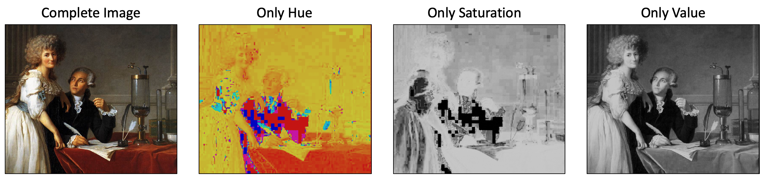
Original image from Wikipedia. Altered images by Ben Lear.
The fact that the brain most easily differentiates based on value means that, if we want to try to map a color to numbers, we should ensure the value maps to it. Such color scales are often called “perceptually uniform.” This is also why “rainbow” colormaps are so bad—they have no intuitive order. A great deal has been written about this, and the Matplotlib documentation on color is a nice place to start, if you want to dive in deep.
2. Use Hue for Categorical Data #
Hue is what most people colloquially call “color” (i.e., red, green, blue, yellow, periwinkle, etc). Because no hue is “more” or “less” than another, it is hard to map hues to numbers in an intuitively meaningful way. Rather, it’s the perfect tool for labeling separate categories.
- Use Case: Showing three different companies on a line chart.
Though hues do not have intuitive number values, there are colors that feel closer together than others. Referring to the color wheel, pairs of colors that are close together (e.g., orange and red) feel more similar than do colors that are far part (i.e, orange and blue). We can use this to our advantage to imply connections between categories.
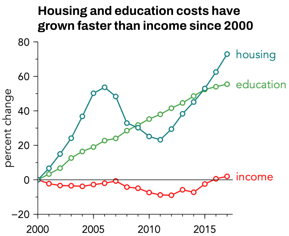
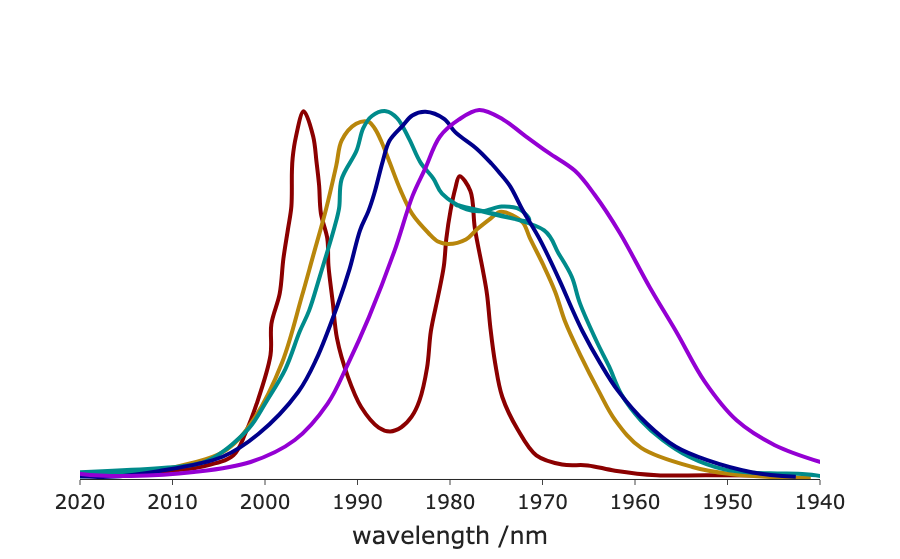
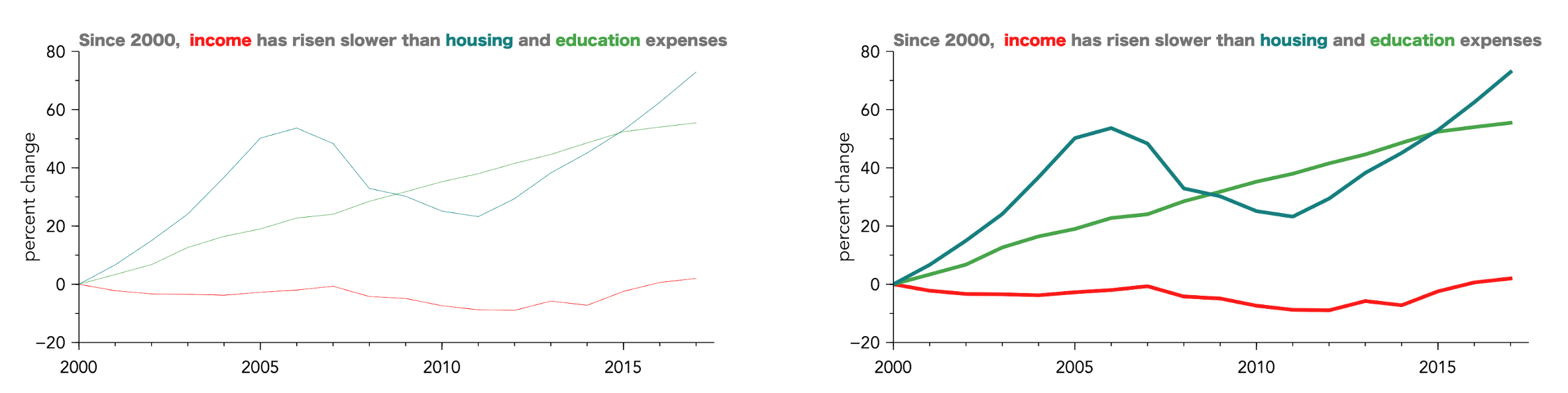
In the plot above, Housing (blue) and Education (green) are analogous (next to each other on the color wheel), so they feel related. Income (red) is complementary (opposite them), so it feels like it’s in a different category.
There are a number of heuristics that can be used to create other types of meaning, and some of them are illustrated below.
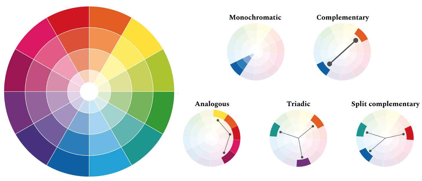
Thus, the example of housing, education, and income used a split complementary scheme.
3. Use Saturation & Value for Cohesion and Emphasis #
If you wish to control how important the changes in color are intended to be, you can adjust the saturation of the color. Reducing the saturation will result in a less vibrant set of colors, where the differences between colors do not jump off the page as much. Turning up the saturation will increase the importance of the color changes.
However, one should be careful to stay within so-called “color families” if you want the color choices to feel cohesive. These families are colors taken from similar regions of the saturation-value plane, and are given names like “pastels”, “neons”, “jewel tones”, and so forth. Some of them are illustrated below.
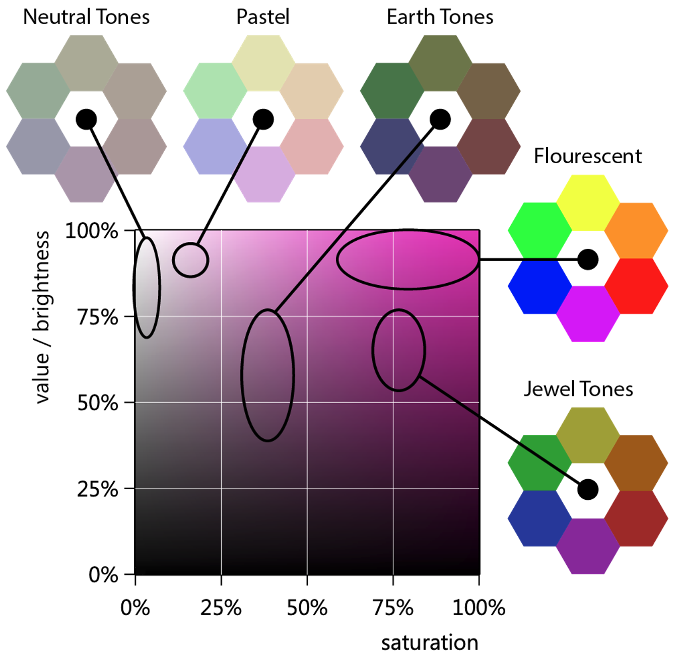
Using colors from a single family makes your plot feel unified and intentional. For instance, if we have a plot with several lines on it, we might choose colors all from the jewel tones, as seen below.
2. Color Theory, or Why the Above Workflow is Effective #
A Note for Scientists: Color IS Perception #
It’s tempting for a technical audience to map color to photon wavelength. This is incorrect. Color is a human perception, not a physical property.
The easiest proof: Magenta.
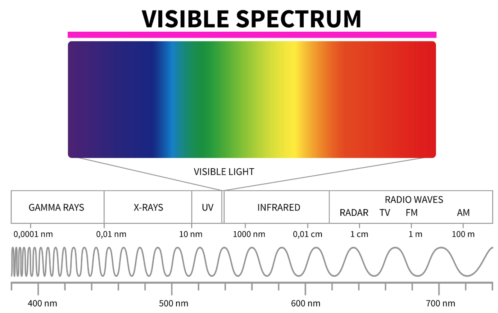
Consider for instance, the spectrum of light shown above. This spectrum reflects the all the colors associated with the various wavelengths of visible light, running from violet to red. Above this is a magenta rectangle. You will see that the color of this rectangle is not present in the spectrum. Simply put there is no single wavelength of light that corresponds to the color magenta.
Instead, magenta is how our brain perceives sensing both red and blue photons at the same time. Similar considerations can be made for many other colors: no single wavelength of light is associated with the color brown, or gray, or teal. Instead, these are formed by the simultaneous detection of 2 or more photons of light.
The key point here is that color is all about perception. This means we need a color model that matches how we perceive.
Why HSV is the Designer’s Model #
Most computers “think” in RGB (Red, Green, Blue). This is a hardware model; the displays used in much of our technology use combinations of red, green, and blue light to create the colors we see on them. One can visualize this process as a cube, where three separate axes control the intensity of red, green, or blue light, as shown below.
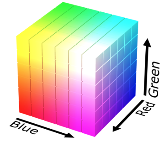
Though the rgb system might seem like a natural way to discuss color, it is not useful for design. Designers use HSV (Hue, Saturation, Value).
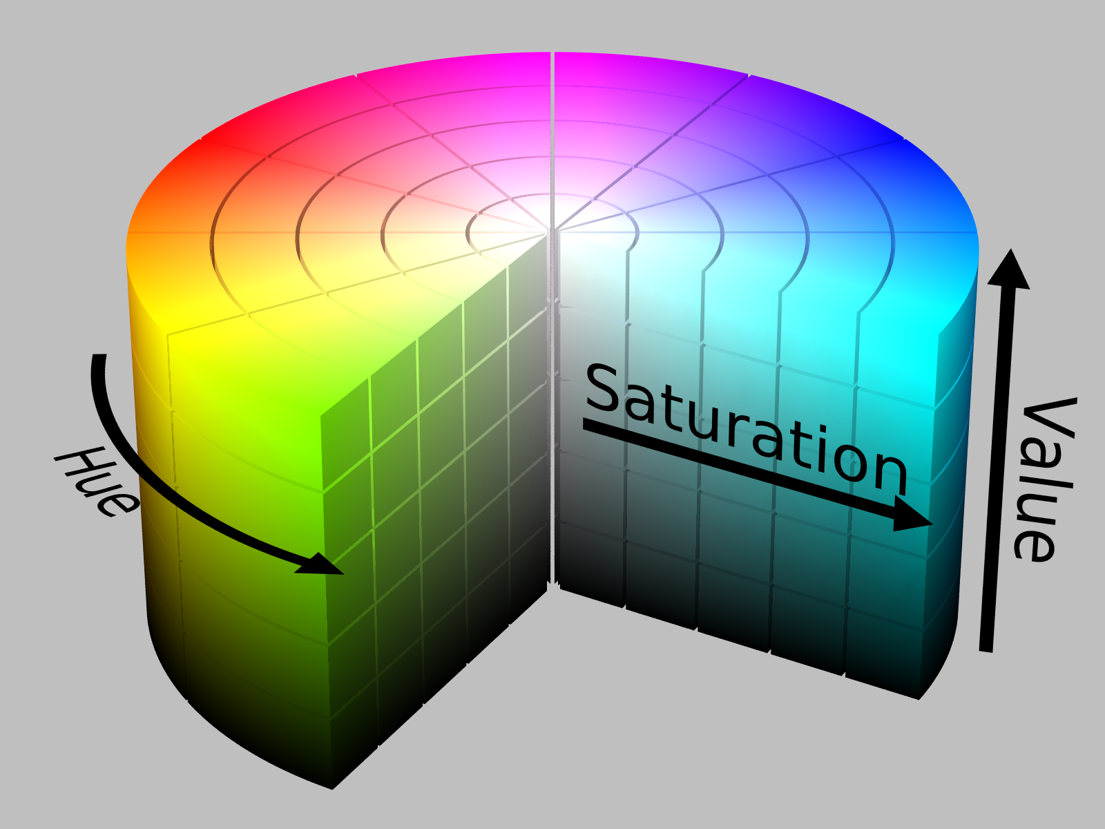
In this model, hue represents what is colloquially called “color.” Value can be though of as how bright a color is. For instance, you might consider having a lightbulb that will produce some color light (e.g., red). If the lightbulb is off, then we are at zero value. If the lightbulb is on at maximum brightness, then we are at maximum value, and we can smoothly move between these two values. Saturation represents how much of our ‘pure’ hue is added in. If we are at some medium value, then no saturation will result in a grey.
This model maps directly to our workflow:
- Hue: The “color” (Rule 2)
- Value: The “brightness” (Rule 1)
- Saturation: The “richness” (Rule 3)
This is why we can build a simple set of rules. We are controlling the perceptual components of color, not just a random mix of red and green light.
3. Before you Publish, Consider Accessibility #
Before you share your work with a wider audience, you must check how others will perceive the color changes.
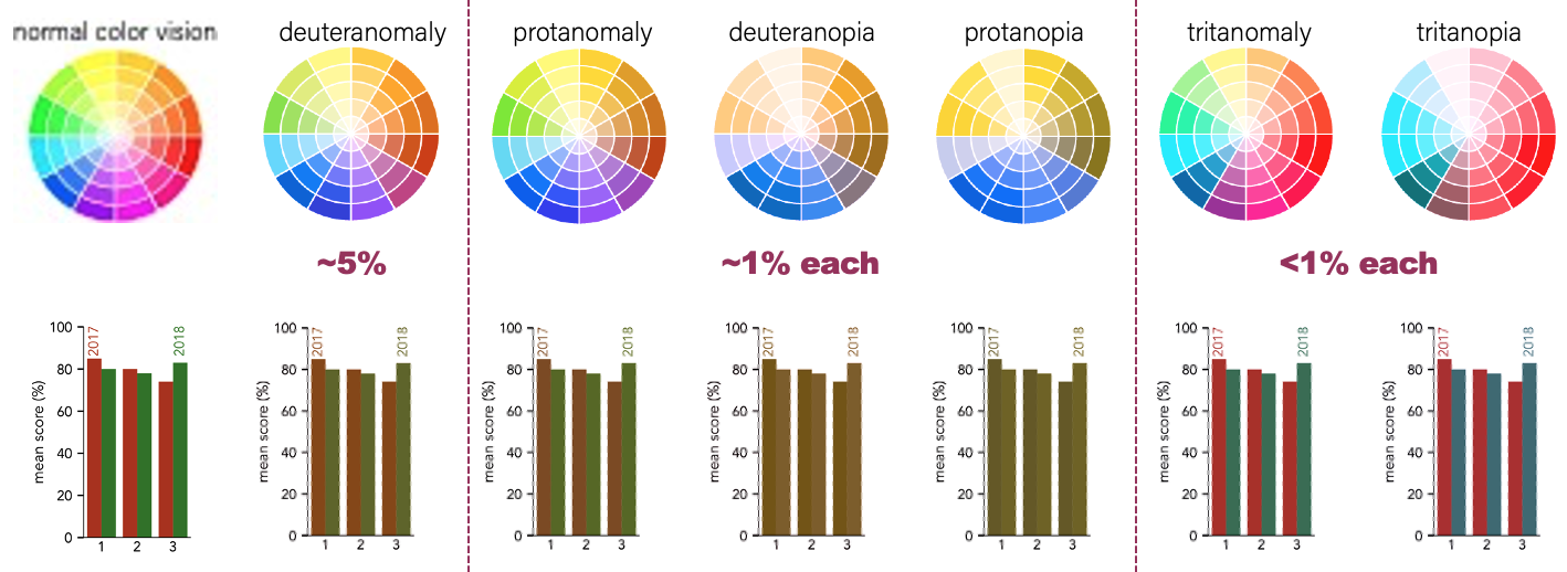
1. Check for Colorblindness #
Over 5% of the population cannot distinguish red and green. Thus, even though red and green might look like good choices to those with normal color vision, this is a problematic paring for a significant number of people. This is illustrated below for a bar chart, which is simulated under the most common forms of color blindness.
2. Check the Size #
The degree of contrast between colors is a function of size. A set of lines that appear quite different when drawn thick, will appear nearly indistinguishable when drawn thin. If we return to the plot of housing, education, and income, we can compare these cases, seeing that the blue and green lines are very hard to tell apart when thin lines are used.
How thick do you need to make features? While there are quantitative guidelines, based on solid angles for the viewer, I think it is easier to just look at a design and be brutally honest about if you can tell colors apart. And, of course, you can always ask a colleague for their opinion.
4. Concluding Thoughts & Good Tools #
You don’t need to be an artist to use color well. You just need a system. By moving away from “picking colors” and toward “controlling Value, Hue, and Saturation,” you can make clear, professional, and beautiful choices every time.
Good tools also exist to help you on your way. An incomplete list is:
- Coolors: This is a website with an excellent color picker/generator, as well as contrast checkers, and community submitted color palettes. This is an extremely good resource when searching for color ideas.
- Coblis: This is a website where you can upload an image, and click through various simulations of colorblindness. This is extremely helpful in checking your complete designs. Additionally, it will simulate grey-scale images, so you can see how designs will look on black and white printers, or on most ereader screens.
Key takeaways #
- Color is perception: Color is not physical wavelength; it is how our brains perceive light. Designing for color means designing for human perception.
- Adopt the HSV mindset: Stop thinking in RGB and think in terms of Hue, Saturation, and Value.
- Use Value for numbers: Use value (brightness) to show quantitative data because it provides the strongest intuitive sense of “more” versus “less.”
- Use Hue for categories: Use hue (what we typically call color) to differentiate categorical data quickly.
- Rely on color families: Keep colors cohesive by selecting them from the same saturation/brightness region (a color family).
- Consider accessibility: Avoid combinations like red and green, and simulate your visualizations to ensure they remain legible to colorblind viewers. Use thicker lines and larger markers to aid in differentiation.
page last modified February 24, 2026